Let the offer shape the hierarchy
A visitor considering a speaker needs different information first from someone exploring a book or workshop.
CASE STUDY · VISUAL SYSTEMS
Defining where a website collection needs consistency—and where the audience needs a different visual expression.
Kimberly Flowers · Product creative direction
01 / THE PROBLEM
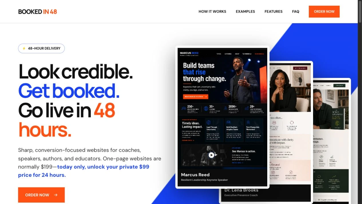
Five offers need different hierarchies: a speaker’s presence, an author’s book, an educator’s workshops, and a coach’s approach cannot all lead with the same content. The challenge was to preserve useful shared behavior without forcing every brand into one composition.
02 / MY ROLE
I varied typography, palette, imagery, content order, and pacing around each offer. I kept the reuse boundary focused on understandable controls, field labels, and feedback. The component playground makes brand, density, and state independently inspectable.
03 / THE SOLUTION
I used specialized page compositions for the five offers and a separate component playground to examine shared behavior across visual directions.
| Design issue | My solution | What changes for the customer |
|---|---|---|
| Different offers competing for the same hierarchy | A speaking-led composition for Marcus, an editorial book narrative for Julian, and structured educational content for Maya. | The page gives the visitor’s decision the appropriate emphasis. |
| Visual identity reduced to a palette swap | Type treatment, imagery, spacing, and section rhythm change alongside color. | Each offer has a recognizable expression and an appropriate reading pace. |
| Variation without a reusable foundation | A component playground with five themes, two densities, and default, error, loading, and success states. | Teams can inspect how a shared interaction behaves when its presentation changes. |
04 / GUIDING PRINCIPLES
A visitor considering a speaker needs different information first from someone exploring a book or workshop.
A distinctive visual identity should still provide understandable controls, labels, and feedback.
Change the expressive elements for a reason. Preserve the interaction rules that help people complete the task.
05 / REUSABLE PATTERNS
The collection shares sample data and lead-form behavior while retaining specialized layouts. The playground supplies a reference for consistent default, error, loading, and success states. A future shared library would add token mappings and usage rules.
06 / THE RESULT
The delivered collection demonstrates five distinct visual directions and a component whose behavior can be inspected across themes. It supports the portfolio’s enterprise cases by showing where I allow visual variation and where I preserve interaction consistency.