Can I do this?
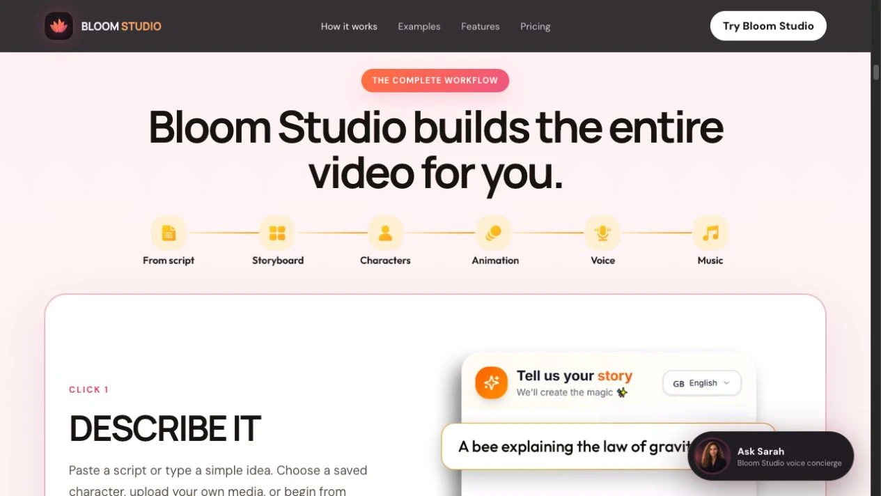
“Describe it,” “Generate it,” and “Teach with it” give the process three recognizable steps. The supporting copy explains what the creator supplies, what the studio assembles, and where editing or export happens.
CASE STUDY · SALES EXPERIENCE
Bloom Studio turns a complicated video production workflow into a sales experience buyers can understand before they commit.
Kimberly Flowers · Product creative direction
01 / THE PROBLEM
A first-time buyer needs to picture the work. What do I start with? What does the studio produce? Can I change the result? A list of features such as lip sync, voice, and motion makes the product sound capable, but leaves the buyer to piece together the workflow.
My direction was to organize the page around a buyer’s decisions. Start with a recognizable task, show what a finished short can look like, then put price and scope together when the visitor is ready to evaluate the offer.
02 / THE DESIGN DECISIONS
“Describe it,” “Generate it,” and “Teach with it” give the process three recognizable steps. The supporting copy explains what the creator supplies, what the studio assembles, and where editing or export happens.
The examples pair a type of creator with a concrete output, such as an educator’s explainer or a business’s product campaign. A shared card layout lets people scan for their own use case.
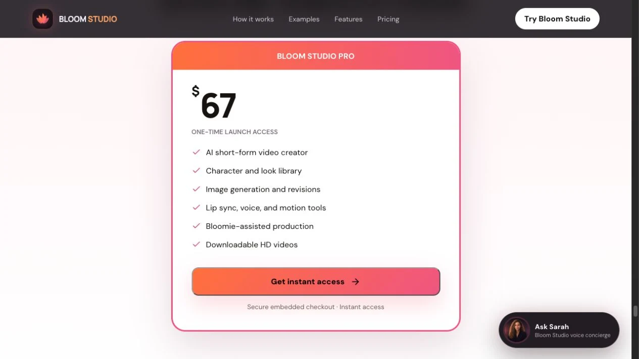
The offer card groups the $67 one-time price, included tools, and purchase action. Visitors can review the terms next to the decision, while the navigation lets returning buyers jump directly to pricing.
03 / TRADE-OFF AND GUIDING PRINCIPLES
Putting the buy button first would serve visitors who already know the product. Leading with every tool would serve people who want to compare specs. I kept pricing one click away and used the main sequence to demonstrate the workflow first. Feature detail and the FAQ give buyers places to check a specific concern.
The reusable patterns are the numbered workflow cards, labeled examples, and the offer card. Each card answers one question in a consistent order. The same patterns can support different audiences by changing the examples and language while keeping the steps and offer clear.
04 / WHAT I WOULD VERIFY
The page gives buyers a route from example to workflow to price. I’d test whether first-time visitors can explain what they need to provide, what they get back, and whether the charge repeats. I’d track checkout starts, completed purchases, and successful access separately to see where buyers need help.
A checkout review found that the hosted Whop offer loads while the embedded form can fail. That makes recovery part of the design. A clearly labeled hosted checkout link can let buyers continue with the same product and price. I’d verify that a completed payment gives the buyer access before promising instant delivery.