Keep ownership visible
A status should explain responsibility. I treated the next owner as part of the result, not a detail hidden elsewhere.
CASE STUDY · PRODUCT EXPERIENCE
Making a cross-team equipment request clear without hiding the work that still has to happen.
Kimberly Flowers · Product creative direction
01 / THE PROBLEM
The difficult part of an equipment request is not entering a name and choosing a laptop. It is keeping one request coherent across three different responsibilities: the employee explains the need, the manager decides, and IT prepares the equipment.
Those responsibilities create a design tension. A short, reassuring flow is desirable, but “approved” cannot mean “ready.” A status that feels complete to one person can leave another person waiting without knowing who owns the next step. I made that boundary the central design problem.
02 / MY ROLE
I set the direction around continuity of context. The request should remain recognizable as the available action changes. I kept the stage list and task panel stable, carried the request details into review, and treated the ownership message as part of the interface—not as secondary support copy.
The consequential choice was to distinguish a decision from fulfillment. I used an approved state that names IT as the next owner instead of ending the experience with a generic success message. That choice shaped the content, status treatment, and sequence of screens.
The trade-off was deliberate: the flow includes a review step and a more specific completion state. It asks for a little more attention than an immediate submit-and-dismiss interaction, but gives the employee and manager an exact request to inspect. I kept the initial form focused on name, equipment, and reason so that the added review did not require a longer intake.
03 / THE SOLUTION
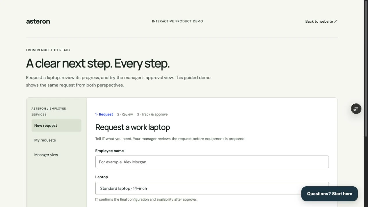
I translated that direction into a three-part flow: enter the request, review the same details, then make the next responsibility explicit. Each element has a job in that sequence.
| Design issue | My solution | What changes for the customer |
|---|---|---|
| Keep the intake small without losing decision context | Use name, equipment, and reason, with helper text about IT review. Place required-field guidance beside the field. | The employee provides the information the sample decision needs and can identify the correction without searching. |
| Make the handoff recognizable | Keep the task frame stable and carry the request details into employee review and manager approval. Use type hierarchy and spacing to separate details from the primary action. | The manager can inspect the request in context; the employee can review what will move forward. |
| Avoid an overpromising completion state | Use “Approved” with an explicit IT-next message. Reserve the status for the decision that actually happened. | The employee can see that approval is complete while preparation remains with another owner. |
DESIGN TRADE-OFF
A single success state would be shorter. A detailed tracking interface could expose more information. I chose a bounded request-and-approval flow: enough context to understand the handoff, without implying that equipment preparation is tracked here.
The cost is a review step and an explicit ownership message. The benefit in the delivered interface is that approval and fulfillment have separate meanings.
04 / GUIDING PRINCIPLES
A status should explain responsibility. I treated the next owner as part of the result, not a detail hidden elsewhere.
Type scale establishes the reading order; spacing separates tasks; restrained borders group information. Blue identifies the primary action.
Validation belongs beside the correction. Review belongs before commitment. Completion text should describe the actual state of the work.
05 / REUSABLE PATTERNS
The reusable unit is a behavior as well as a visual component: the stage list orients, the task panel focuses, the summary preserves context, and the status names the next responsibility. Those roles stay stable even when the fields change.
I would use four acceptance checks when extending this pattern: the current step is identifiable; submitted details remain inspectable; the primary action matches the user’s authority; and the result names what happened and who acts next. This gives a delivery team a concrete quality bar rather than a request to make another screen “look consistent.”
The boundary matters. A different service request can reuse this structure, but delegated approval, multiple items, preparation tracking, and failed handoffs require additional states. They should be designed explicitly rather than squeezed into an “Approved” message.
SUPPORTING SCREENS
06 / THE RESULT
The delivered walkthrough makes the handoff visible end to end. An empty form gives field-specific guidance; review shows the entered details; the manager sees the request before approving; and the approved state identifies IT as the next owner.
The quality improvement is specific: the interface no longer has to use one generic completion message to represent several different responsibilities. The customer can distinguish a completed decision from work still to come. To evaluate comprehension, I would ask employees and managers to explain the current state and next owner at each handoff before offering assistance.